
Wedding Color Schemes
Wedding color schemes or palettes play a significant role in creating better photos for a wedding couple on their big day. Want to look your best in your wedding photos? Understand how the color scheme you choose contributes to creating better photographs in these five key ways.
01. Create Consistency
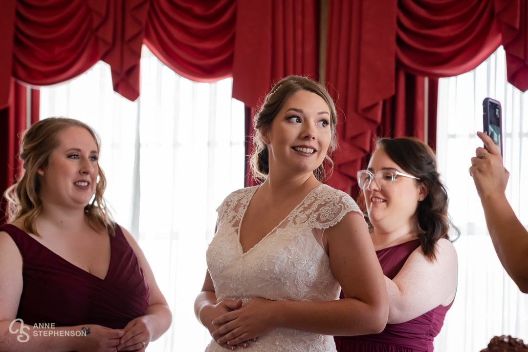
Use a consistent color scheme to give a cohesive look and feel throughout the wedding. A carefully chosen color palette brings together different elements of the wedding, such as the couple’s attire, floral arrangements, and décor, to create a unified visual experience. This allows photographers to capture a consistent and polished look, making for a more visually appealing overall collection of photos. For couples interested in an album, photobook, wall art, video display, or social posts, a consistent look translates into more visually appealing pictures that capture the mood and atmosphere of the event.
02. Set the Tone
Colors often have a powerful effect on our emotions. Choosing the right palette sets the tone and mood of your wedding. Explore these five color combinations for effective mood-setting.
Classic
For a timeless look, pick neutral colors like white, ivory, and gold. These colors suggest elegance, sophistication, and tradition, making them perfect for a formal or traditional wedding.
Romantic
Soft, pastel shades such as blush pink, lavender, and dusty blue lend themselves to a romantic atmosphere. Often associated with love, tenderness, and sweetness, these colors make a perfect choice for romantic weddings.
Bold
Lively and festive weddings call for bold and vibrant colors. Consider pops of red, orange, and/or hot pink. People often associate energy, fun, passion, excitement, and enthusiasm with these types of colors.
Rustic
If nature, warmth, and simplicity appeal to you, choose natural and earthy colors like brown, beige, and green. These work particularly well to add warmth to a winter wedding or reflect the outdoors during a summer wedding.
Modern
Unconventional colors like black, navy, and gray bring a modern and contemporary feeling to a wedding celebration. These colors call to mind sleekness, edginess, and minimalism. They work particularly well for weddings centered on a modern, more industrial feel.
03. Enhance Your Features
Select a color scheme that complements both you and your partner. Look for colors that enhance skin tone, hair color, and eye color. Picking the right tones and shades will bring out your natural features in photographs, making you look your best.
Skin Tone
Factor in the color of your and your partner’s complexions when selecting a wedding color scheme. For warm-toned skin, colors like ivory, champagne, peach, and gold generally work best. If your skin contains cooler tones, check out colors like blush, lavender, mint, and silver.
Since you and your partner will likely have different skin tones, you may need to find a palette that works for both of you. Consult with your wedding professionals at your dress and suit store for suggestions on how to find a color that enhances both of your features and makes you both feel confident and beautiful.
Hair Color
Hair color may also influence your wedding’s color palette. Blonde hair looks beautiful paired with soft pastel colors like pink, and blue. Redheads look amazing with bold jewel tones like emerald, sapphire, and ruby. Darker hair colors may also explore bold jewel tones and earthy tones like brown, beige, and green.
Eye Color
Choose colors that contrast or complement your eyes.
Blue
Soft shades of pink, peach, and lavender often make blue eyes pop. Warm earthy colors like rust, orange, and gold also tend to look great with blue eyes
Brown
Shades of green, gold, and copper bring out the warmth in brown eyes. On the other hand, cool colors like navy blue, silver, and gray, provide a beautiful contrast.
Green
Enhance green eyes by deciding on colors that bring out the natural shades of green. Shades of purple, pink, and red complement green eyes. Earthy colors like brown, beige, and taupe create a more natural look.
Hazel
For hazel eyes, try out shades of green, gold, and brown to bring out the green and brown tones in your eyes. Soft pink and lavender colors also complement hazel eyes.
04. Use Analogous or Complementary Colors
Analogous
Colors that sit next to each other on the color wheel work together to make a balanced and visually pleasing composition in photographs. Color theory experts recommend choosing a primary color as a base, then adding two more to highlight in an analogous color palette. Make sure the base color dominates and the other two colors highlight, not overwhelm. Also, be wary of choosing colors that are too closely related, as they may blend together and wash out your design.
Cooler analogous color palettes (like blue and green) tend toward a calming and serene feeling, while bold colors (like red and orange) develop a lively and festive atmosphere.
Examples
- Violet, blue, and teal
- Red, fuchsia, and purple
- Red, orange, and yellow
- Green, blue, and purple
Complementary
Colors that exist directly across from one another on the color wheel contrast highly with each other, giving a bold design statement. The trick to complementary colors involves picking one of the hues as a main color, then using the complementary color to highlight and emphasize important items to make them stand out. Look to contrasting color schemes in nature for a vibrant, yet natural feel like orange coral on the blue ocean.
Examples:
- Red and green
- Blue and orange
- Yellow and purple
- Yellow-green and red-purple
- Red-orange and blue-green
05. Leverage Contrast
Contrast creates depth, interest, and visual appeal in photos. Notch up the contrast for more dynamic photos. Here’s how:
Light and Dark Colors
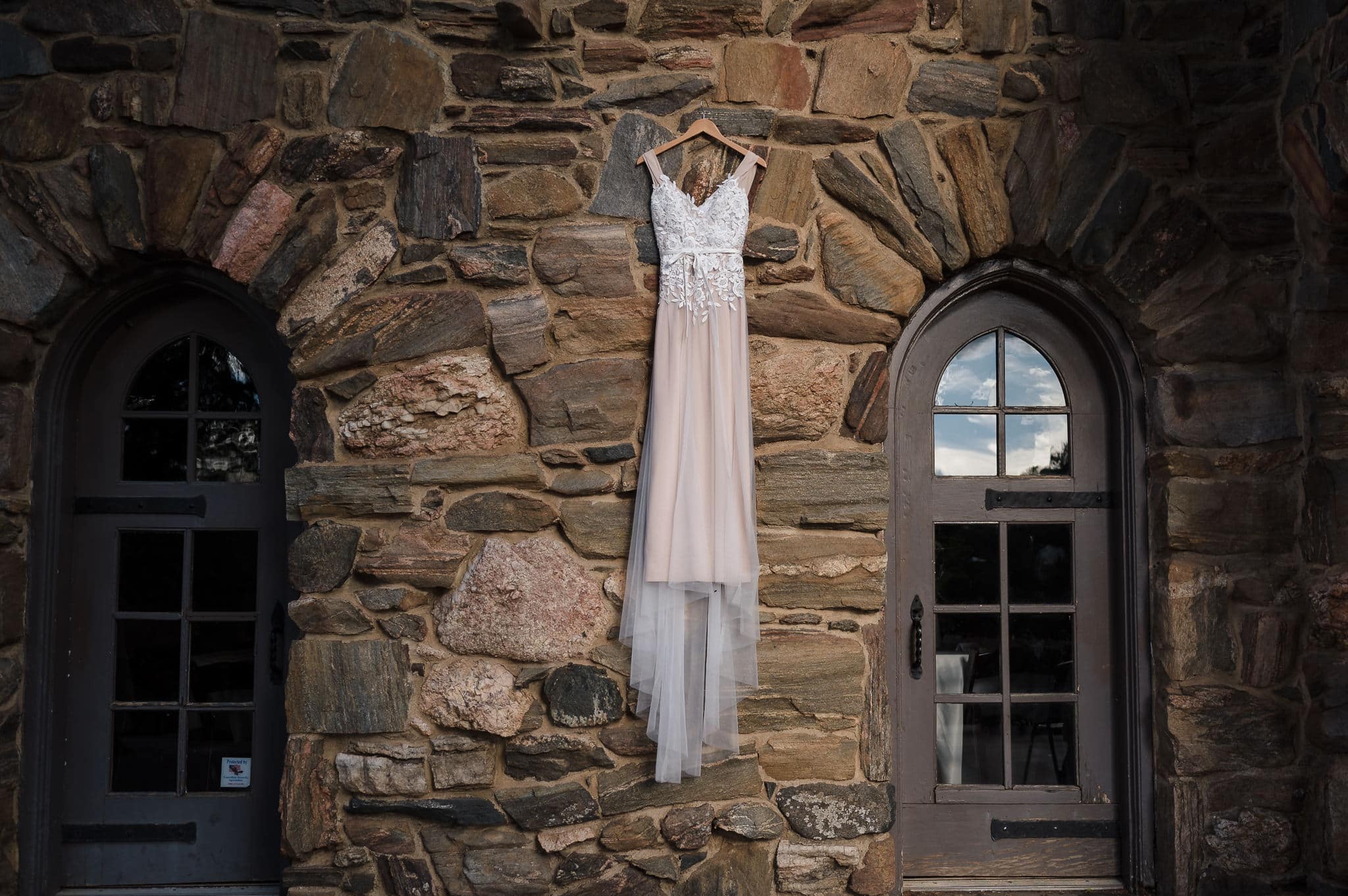
Partner a light and dark color together to easily make a strong contrast. For example, a white wedding dress with a black tuxedo makes a classic and timeless contrast.
Complementary Colors
Complementary colors exist opposite each other on the color wheel. For example, choosing blue with orange or yellow with purple generates a vibrant and eye-catching contrast.
Warm and Cool Colors
Warm colors like red, orange, and yellow give a contrasting effect when paired with cool colors like blue, green, and purple. This contrast provides a sense of depth and visual interest to your photos.
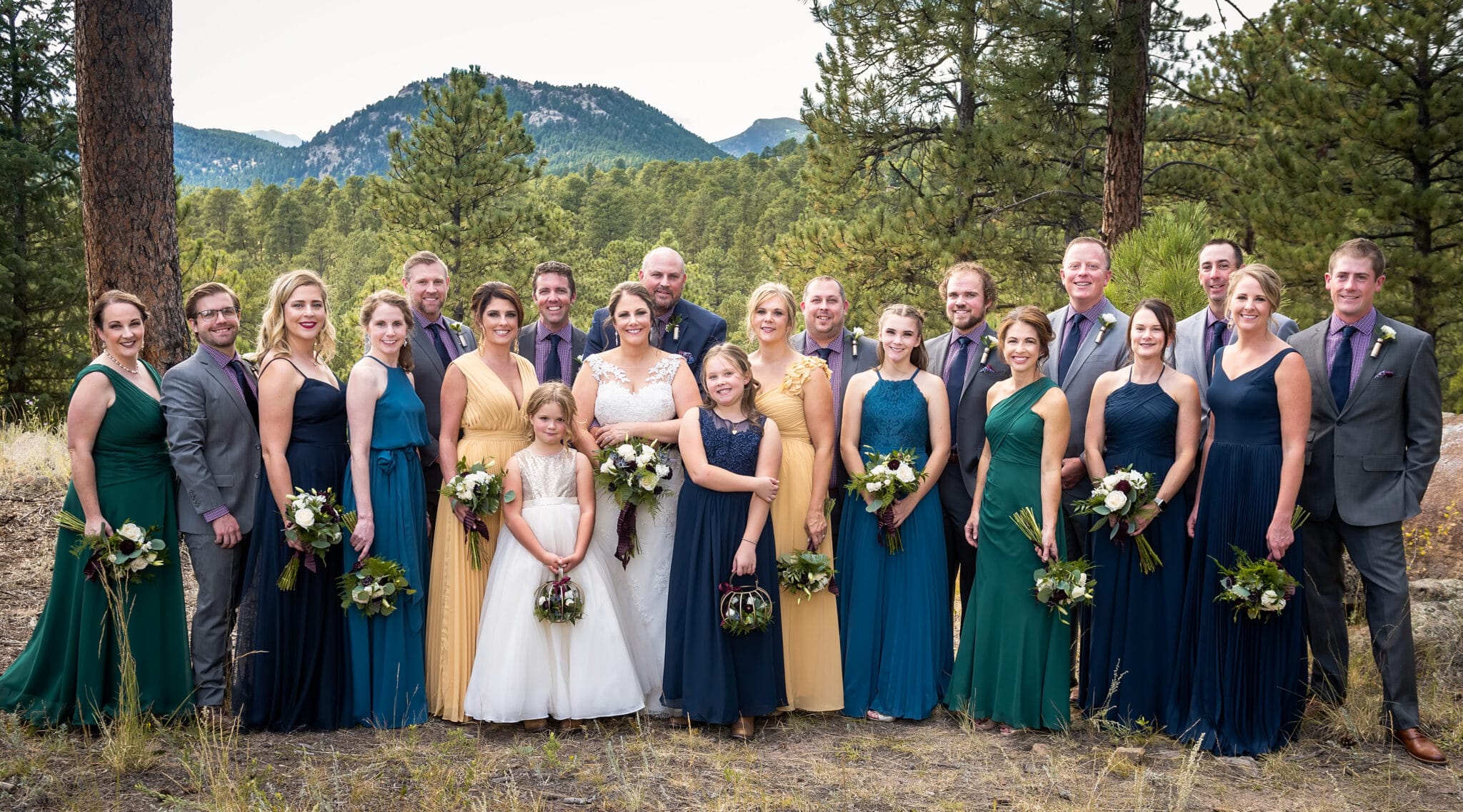
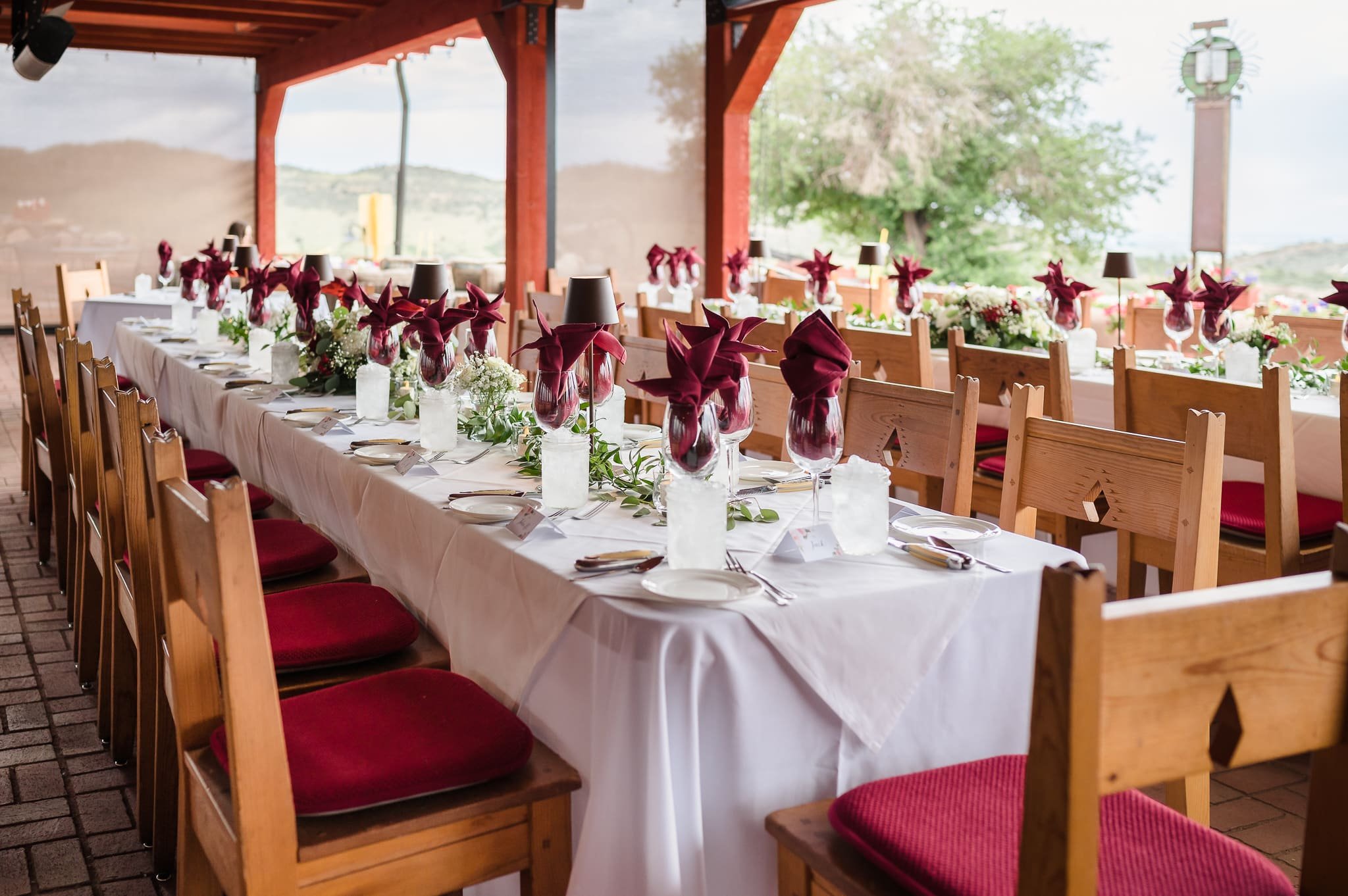
Color blocking
Incorporate blocks of color in your wedding decor and attire to develop a strong visual contrast. For example, bold colors like red for the bridesmaids’ dresses against a neutral backdrop give drama and visual appeal.
06. Explore Wedding Color Schemes
Thinking about a particular color scheme for your wedding? Try on a few ideas in our sample gallery below of color palettes used at real Colorado weddings.
For further inspiration, click on the color palette block photo to see details about each of the weddings.
Remember well-chosen wedding color schemes help create beautiful and cohesive stories for the best photos!

07. Seasonal Wedding Color Palette Inspiration
Spring
Summer
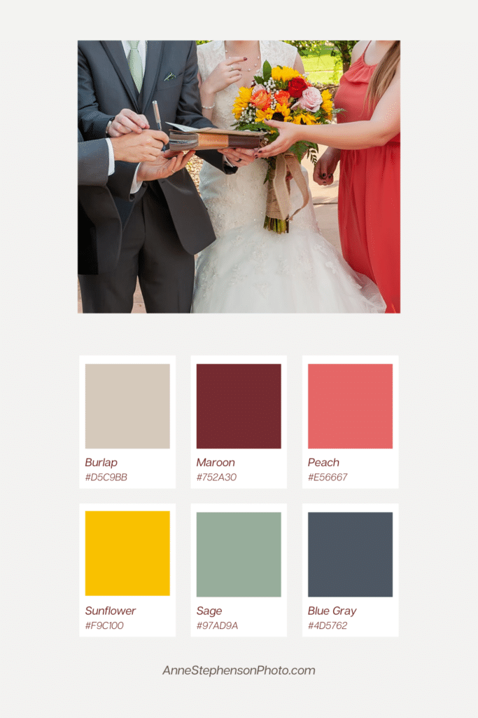
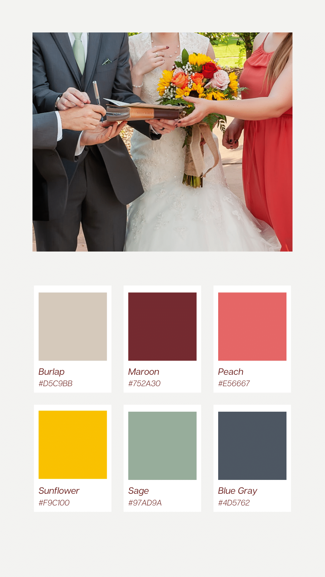
- Vintage Summer Wedding – Burlap, Maroon, Peach, Sunflower, Sage, Blue Gray
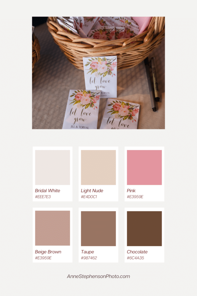
- Pink with Earthy Neutrals – Bridal White, Light Nude, Pink, Beige, Taupe, Chocolate
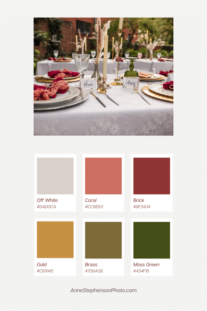
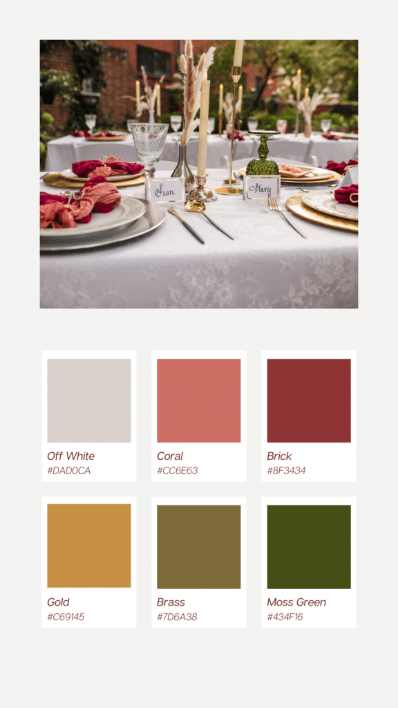
- Vintage-Inspired Boho – Off White, Coral, Brick, Gold, Brass, Moss Green
Autumn
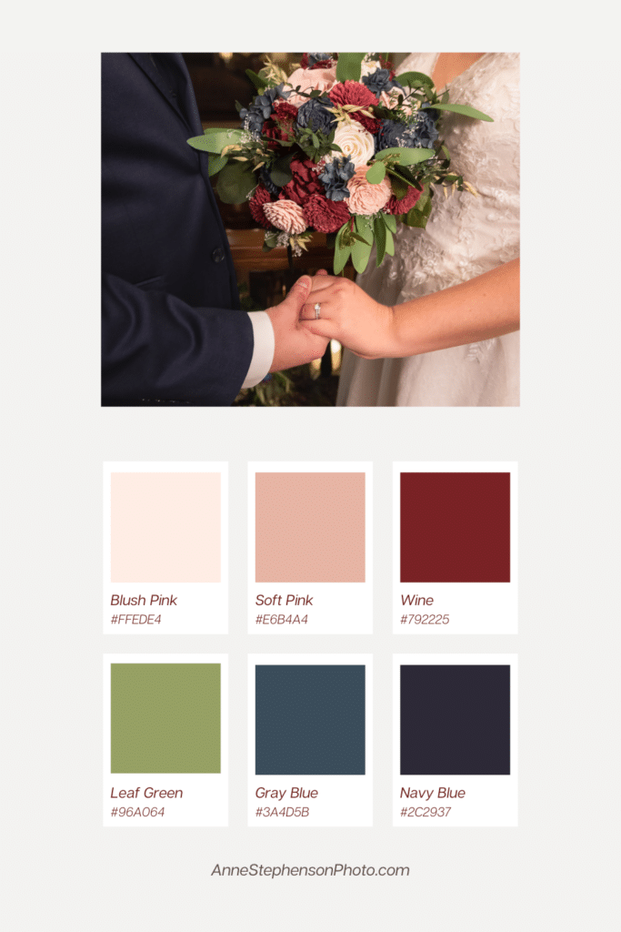
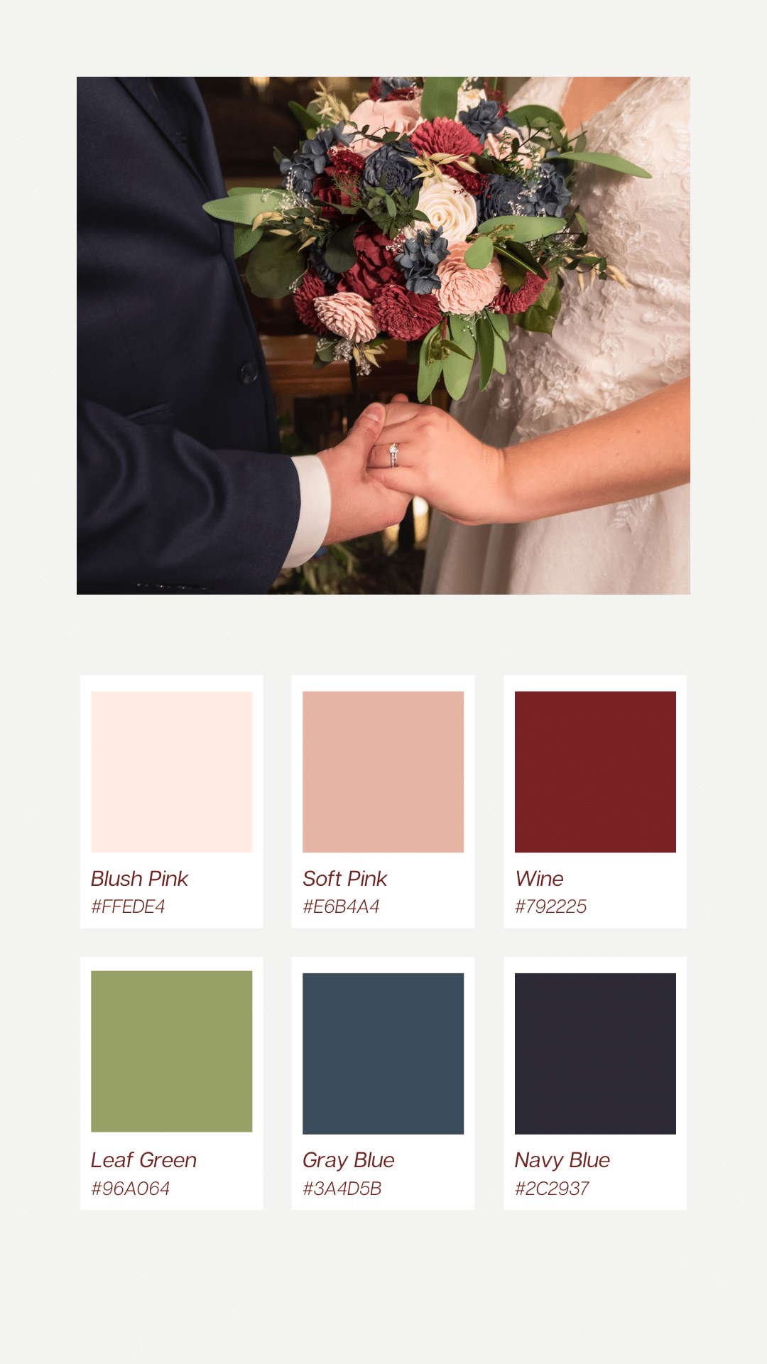
- Classic Fall Wedding – Blush Pink, Soft Pink, Wine, Leaf Green Gray Blue, Navy Blue
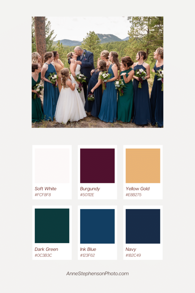
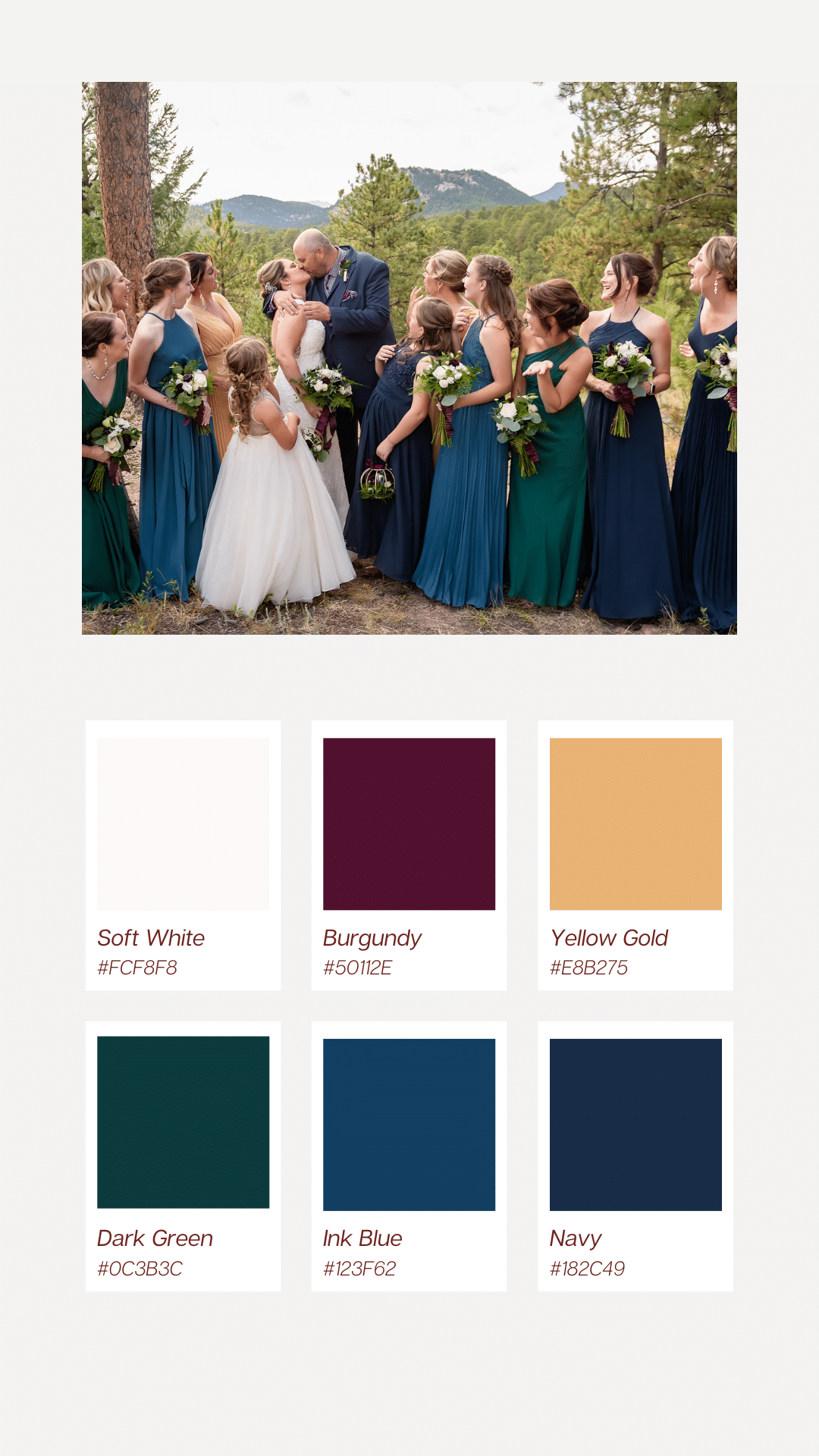
- Jewel-Toned Wedding – Burgundy, Yellow Gold, Dark Green, Ink Blue, Navy
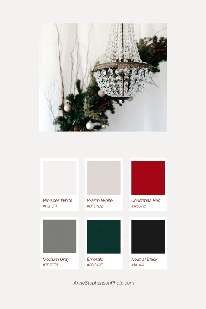
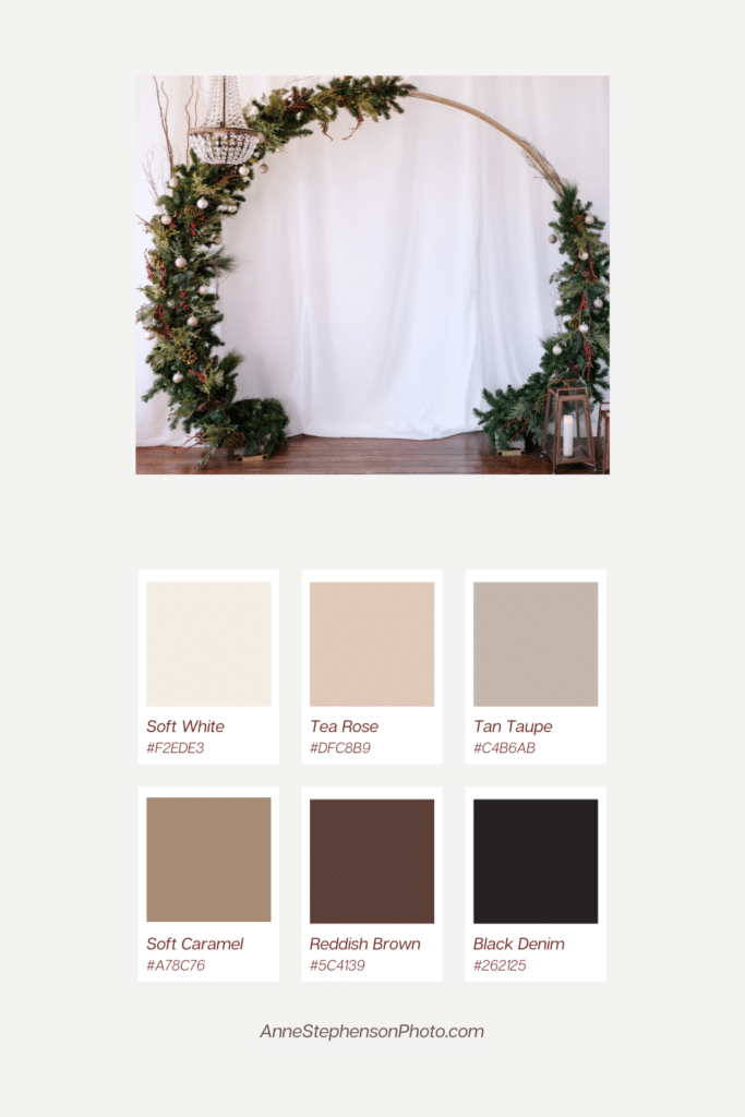
Winter
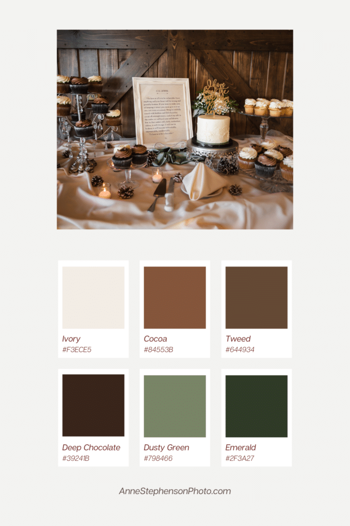
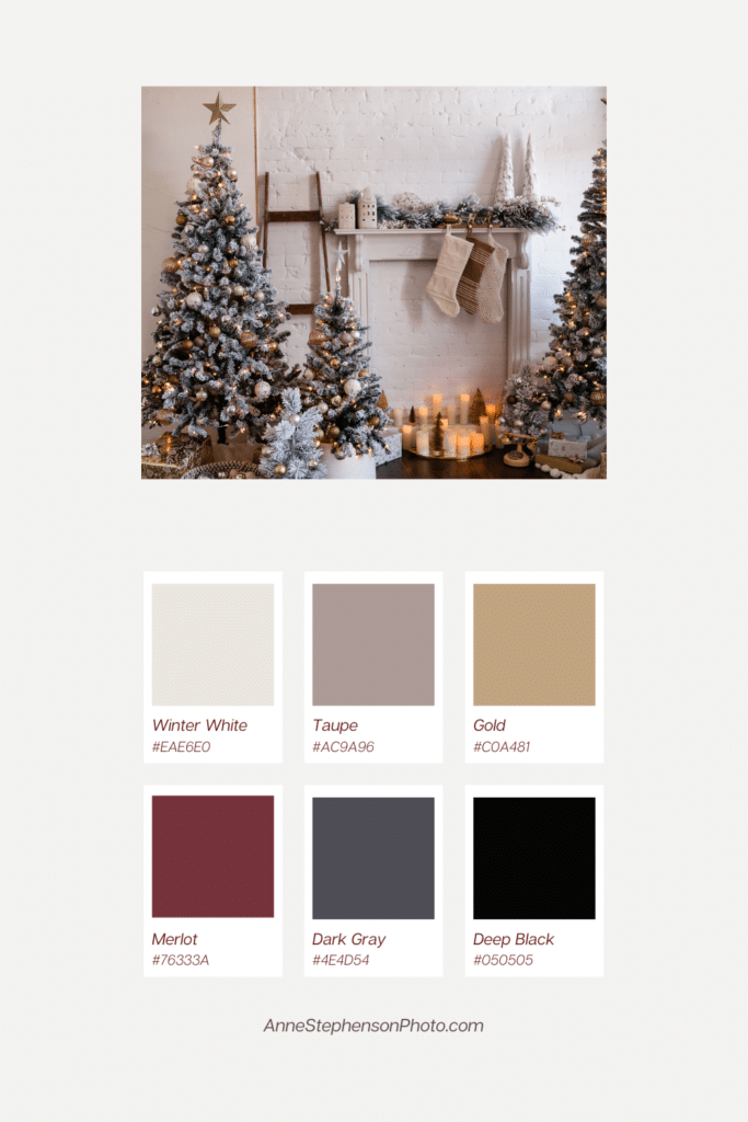
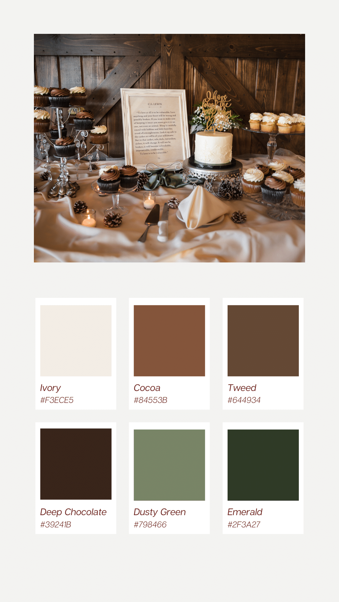
- Warm Winter Wedding – Ivory, Cocoa, Tweed, Deep Chocolate, Dusty Green, Emerald
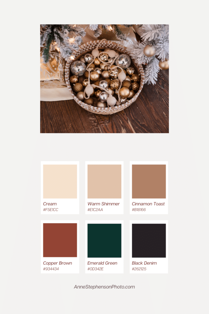
- Holiday Inspired Color Palettes to Borrow from Portraits
08. Additional Wedding Color Schemes
Pantone’s Color of the Year – 2026
Soft, airy, and white, Cloud Dancer (Pantone 11-4201) is ideal for weddings. Symbolizing peace, clarity and new beginnings, the color promotes a romantic and quietly luxurious aesthetic.
Pantone’s Color of the Year – 2025
For 2025, Pantone chose the sophisticated and earthy hue of Mocha Mousse (17-230) as the color of the year. This rich and warm color exudes comfort. It plays well with soft, muted shades like sage green, dusty rose, and French blue. It also accompanies bolder, deeper colors like burgundy or ochre that need some levity.